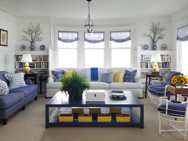
For a cohesive look when you are bringing together items from two households s a couple, pick one or two colors you love (max) and incorporate them in at least three places to make the colors stand out as an obvious theme and decor throughout the space. Using more than two colors can look chaotic and messy for non-pros.
- The colors don’t need to be bright – Repeating them across at least three places within your accessories and decor will create a unified look even if they are soft or neutral colors.
- If you do pick more than one, they should be complementary, for example, pewter and beige, blue and grey, pale yellow and white or teal and mint.
- If you pick a bright color and want to use it to paint, start with one feature wall and let the others be neutral so it doesn’t overwhelm.
- If you can’t paint as a renter, my favorite places to bring color into accessories are in the curtains, throw pillows, rugs and artwork. You can also try candles, lamp shades, throw blankets and picture frames.
Pick up some affordable and high-quality paint here: UK Readers or USA Readers
Get some of this stuff here:
- Colored Curtains for UK Readers or USA Readers
- Colored Throw Pillows for UK Readers or USA Readers
- Rugs for UK Readers or USA Readers
- Artwork for UK Readers or USA Readers
Contributor: Erica Leigh Reiner | Owner of E. Leigh Designs
Company: eleighdesigns.com | Instagram